Quark logo, take 2 24 Mar 2006
37 comments Latest by Puppets
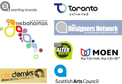
Six months ago Quark offered up their new logo which looked a little bit like these logos. Today they offer up a brand new one. I wonder how much this cost them. [via DO]
Six months ago Quark offered up their new logo which looked a little bit like these logos. Today they offer up a brand new one. I wonder how much this cost them. [via DO]
37 comments so far (Jump to latest)
Jeremy Baines 24 Mar 06
Nothing! I read it was done in house.
Tory 24 Mar 06
I think the old new is better than the new new.
JF 24 Mar 06
Nothing! I read it was done in house.
There’s no such thing as nothing. Letterhead, business cards, changes on the site, etc.
siftee 24 Mar 06
Haha very similar to sony-ericsson!
Jeremy Baines 24 Mar 06
You asked how much the logo cost ;) but i know what you meen.
I think it is a shocking design and not the good sort!
Nathaniel Bibler 24 Mar 06
Isn’t the new Quark logo just Apple’s power button, rotated and skewed?
Caleb Buxton 24 Mar 06
A friend of mine did a word mark that incorporated the same circle with a square corner thing — when i pointed out the similarity between his mark, and that one, and that one, and that one he called me cynical :(
MH 24 Mar 06
Not only is the new logo bad (too much detail, too many gradients, shadows), it’s poorly reproduced on their home page. Notice the small “notch” in the upper left.
It doesn’t translete well to small size/one color. Look at the favicon. It looks like a totally different logo.
Jonas Feiring // Fatguy 24 Mar 06
I actually think this one is quite good.
It does take guts to admit you messed up with a redesign, and then redo it just months later. Big brands are often stuck with bad design decisions for years.
How they ended up with that first miserable attempt, is of-course an interesting question. So much rebranding is done by “throwing the baby out with the bath water”. Hopeless rebranding efforts that alienate the users / customers.
You see the same thing in web-development. If you can’t keep your site constantly evolving and adapting, you’ll end up with big, costly projects of mediocre quality every fourth year.
At least, here quark took a step back, went for a second attempt, and I, for one, think it looks destinctive and unique enough to work in this market.
If you can do a minimalistic, web-friendly, illustrator-killer, Quark. I’ll marry you on the spot.
Peace!
MH 24 Mar 06
@Jonas: It does take guts to admit you messed up with a redesign
I think it makes them look like amateurs. One of the main points of branding design is to do it right, because the brand is sacrosanct and shouldn’t be messed with. Redesigning six months later is messing with it.
MH 24 Mar 06
Before someone argues that Quark is just “Getting Real,” that might be the case it they had made small incremental changes. But they threw it out and started over.
BTW, I’ve been lucky enough to only have had to use Quark for a single project (since I mostly do web work). It was like trying to do the riverdance in molasses…
Don Schenck 24 Mar 06
I think the new logo is gorgeous, but MUCH MUCH too complex. Just doesn’t work.
Hmmm … much like some women I know! *laugh*
street 24 Mar 06
It would be pretty cool if their new logo somehow implemented their brand motto:
“Publishers, Thanks for being such a loyal group of Retards”
Chris 24 Mar 06
Is this new logo backward compatible with the old logo, just like the new beta of QuarkXPress7 isn’t? Anyway, the new logo is hideous.
Kendall 24 Mar 06
I think that the favicon looks better than the actual logo. I agree that there are too many gradients. I think it’s better than the previous logo but it could definitely use some refinement.
Michael 24 Mar 06
There are many issues with this logo. But the first thing is thought of was Monster.com… Go ahead and take a look. It this this type of poorly thought excution that plagues the whole product. Its day is DONE.
Nathan Rutman 24 Mar 06
I like the favicon better too - much more simplistic and striking than the effect-laden rendition in the upper-left.
I actually didn’t hate the last logo. I know it was used everywhere, but it’s such a basic shape treatment that I think a brand like Quark could have made it something (if they could have side-stepped lawsuits by organizations with similar logos).
The object with a logo (in my mind) isn’t necessarily to get something that looks different from everybody else, but rather to have your name/mark associated with each other. Usually a unique mark goes towards that end, but it can work with common marks - as long as your market thinks of you first when they see the shape. And I think Quark could have pulled that off.
It’s almost like they want to self-destruct. So much for American ingenuity.
Edmundo 24 Mar 06
Hah, I didn’t know Quark was a division of Monster.com. ��
Long live InDesign!1
brian warren 24 Mar 06
Nathan, you nailed it. The new logo is freakin complex and looks far too 3D to be memorable. If they flattened it out it would look nice.
Alternatively, the white part of the logo is fairly unique and interesting. Maybe toss out everything that’s any shade of green in the logo and keep that white shape, change that to green and you might have something.
I question why they changed it at all back 6 months ago. I’ve got a photoshop 4 box on my shelf here and the adobe logo is the same on that box as it is now. I dont get why some companies change logos. If a company is having an identity crisis, keep the design out of it until things settle down. Then decide if your logo is completely inaccurate for what you are trying to present to the world.
Josh Williams 24 Mar 06
Wow. That’s really ugly. The 3D was definitely a mistake… as most (not all) 3D logos are.
Dan Boland 24 Mar 06
Yeah, the new logo stinks. It’s just ugly. I think it would have been in their best interest to tweak and modernize the old logo, since it was still so recognizable.
Chris H 24 Mar 06
The new logo is really bad. The leg in the Q shape is so out of balance visually - very awkward. The surrounding circles just confuse the issue and the 3D fails to improve upon it. After all, you can’t polish a turd.
3D-ish logos can work sometimes (like with the new UPS and at&t logos) but it’s definitely overkill here.
The old new one was good - shame it had already been done. After that fiasco, i think I would’ve just gone back to a modernized version of their old old logo. I mean…seriously, while it wasn’t particularly exciting or great, it also wasn’t that bad - and at least people recognized it.
That said, it’s easy to see how such a crap logo came out of a company who’s software UI is still as ugly as it was 3 or 4 versions ago.
So, in summary, it’s a perfect fit for Quark. ;)
Quark is dead to me. Long live InDesign.
Benjy 24 Mar 06
Wow, that’s quite a 180 degree turn in just 6 months. The first logo seems to say “simple, easy-to-use, design-focused, friendly” but the second logo seems to say, “teenage gamer.” Shouldn’t a logo represent a company’s ideals and values in some way? Because I’m sure that Quark’s values haven’t changed in 6 months.
I’d think they could have worked off the old new logo and evolved it a little to make it stand out from the other similar logos, say add a subtle gradient to it and maybe a notch to define the descender.
Danno 24 Mar 06
The favicon of the new logo is pretty good, it’s just the beveled and gradiented to hell version on their frontpage that sucks.
Dave Simon 24 Mar 06
I agree with Danno, the new logo as favicon is pretty good. The shadow/gradient/3D one sucks.
Funny though that the favicon actually tries to incorporate a “TM” in the bottom right corner. That’s just silly.
Drew Pickard 24 Mar 06
:)
Drew Pickard 24 Mar 06
Oop, images tags not allowed …
Ubisoft??
http://wham.canoe.ca/news/2005/06/16/ubisoft.gif
kyle 24 Mar 06
I’m not sure they even need an icon. The wordmark by itself is strong. Less is more.
Don Wilson 24 Mar 06
How much did it cost them? I hope not much.
Bryce 24 Mar 06
@Rundle-fly: ick - that Astrazeneca logo looks like a bowel. Is AZ some kind of intestinal medication? Then they seem to have nailed their brand perfectly…
Nathan Rutman 25 Mar 06
Someone should e-mail Quark this thread. :-)
Edmundo 26 Mar 06
I also noticed that the Fedora Core 5 logo is different from it’s previous versions, and it’s now a cross between the previous Quark logo and the recent Macromedia Flash logo.
look at it: http://upload.wikimedia.org/wikipedia/en/6/68/Fedoralogo.png
What ever happened to you know… the FEDORA?
FataL 29 Mar 06
New new logo looks like peice of garbage. On Quark site it appears in bad taste appearance.
Personally I like old one. All they need is release Quark 7, not changing branding back and forth.
Benjamin Sandoval 05 Apr 06
UGLY!!!!
but it was clear the previous one was a Cut & Paste of other Companies logos…
Puppets 01 Aug 06
film sexy gratuit