
Pagehand is a word processing app designed exclusively for Mac OS X. It has some unique UI touches for being a desktop word processor. (One of the app’s features: “Never forces you to choose from a bewildering array of small icons.”)
Say you have a document open and you want to change it from one column to two columns, you click the ‘Columns’ button in the toolbar:

And the toolbar gets replaced by a special “columns” state.

Check out how you set the options:

When you’re done, you click in the body of your document to revert the toolbar back to its normal state.
That’s a very different approach from the Word-style dialog box with 10 fields in it. The downside is you have to navigate quite a lot to do simple things. But maybe it’s better in the end.
Separately, it’s interesting how the app’s UI is used for the layout of the app’s marketing site too:

Neil Kelty
on 05 Aug 09Are you no longer posting as individuals and instead going The Economist route and posting all things as the company/magazine?
Alejandro Moreno
on 05 Aug 09What if instead of the clunky drop-down list you got a “Columns” sidebar panel, like the “Character” and “Paragraph” ones?
I really like their toolbar buttons, but I think they could make better use of that sidebar and make visible all those options hidden away in a drop-down at the same time.
Kudos for trying something different, though!
James Gartner
on 05 Aug 09Speaking of interesting UI choices, have you seen the new “Mac AppStore” Bodega? They have a neat awning at the top of their window to simulate a storefront. htttp://AppBodega.com
They just launched a couple days ago, but they seem to be getting some traction.
ML
on 05 Aug 09Are you no longer posting as individuals and instead going The Economist route and posting all things as the company/magazine?
When it’s a post that multiple people contribute to (or if it’s a generic company post), we list it as “posted by 37signals.” In this case, it was a post that Ryan and I combined efforts on.
Alex King
on 05 Aug 09It sounded cool when I heard about it the other day, but for something that is supposed to be about a fresh design, it sure doesn’t impress the eye very much. The sidebar is kinda annoying to look at. Styles don’t seem alot easier to use than Word.
The site-that-looks-like-the-app is kinda interesting, and gets those screenshots out there, but it’d be alot better if it actually looked nice, imo.
Greg
on 06 Aug 09I think it’s awesome that Pagehand has taken the do less approach and is willing get into a market that has so many players and compete by being simple. Of course I’m sure it will take some time to get their UI just right, but they get my vote for building an application that doesn’t get in my way when I’m writing.
Ivan
on 06 Aug 09Looks like a simplified MS Ribbon with context groups in it.
David
on 06 Aug 09First time user – yay, I figured it out! 1000th time user – ugh, can’t I do this in one button?
Rahul
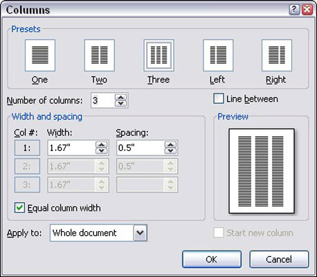
on 06 Aug 09Word 2007 and up use the much improved Ribbon UI. Here’s a screenshot of the columns dialog they use there: http://dl.getdropbox.com/u/204960/columns.png
I agree that Page Hand looks a lot simpler, and even seems to use UI patterns that appear more often on the web than in apps.
Erik
on 06 Aug 09I have to agree with David. Appears that it would be a bit cumbersome after the first time. I like the msft Ribbon UI in that it gives me those options I want to use in a clear way, and I can see at a glance all settings at once, rather than one-at-a-time.
However, I also have to agree with those saying “kudos for doing something different.”
Mike Hoefer
on 06 Aug 09I’ve only taken a quick look at the app but what struck me was that it looked to be taking better advantage of a larger display space that we all have these days.
If you think about it much of the application interface paradigms we cling to today have roots in the need to be efficient within the original 9” Macintosh screen.
Now that the smallest iMac you can buy has a 20 inch display should not our interaction interfaces evolve to take advantage?
Looking forward to giving Page Hand a try.
This discussion is closed.