Last week, we shared a few things we’d learned about UI in mobile WebKit browsers. In that post we touched briefly on the idea of using CSS3 to make form inputs that look and feel the same in all WebKit browsers across platforms. Today I’d like to share some specific examples of how we did that.
Getting started
Customizing form elements in WebKit browsers all starts with applying the -webkit-appearance property to all inputs:
input, textarea, select {
   -webkit-appearance: none;
 }
This removes all of the browser’s default styling from the inputs. You can then apply your own CSS styles.
Base styles
I started by adding some basic styles that would be common to all inputs:
input, textarea, select {
   border: 1px solid #555;
   padding: 0.5em;
   font-size: 15px;
   line-height: 1.2em;
   width: 80%;
   background: #fff;
   background: -webkit-gradient(linear, left top, left bottom, from(#fff), to(#ccc));
   -webkit-appearance: none;
   -webkit-box-shadow: 1px 1px 1px #fff;
   -webkit-border-radius: 0.5em;
 }
That gives us some consistent treatment (and the checkboxes and radios now are visible again), but we’ll need to address some of these specifically.
Getting specific
Using the [type=] attribute selector in our CSS, we can specify styles for each input by kind. For example here are some addtional styles that will be applied to checkboxes and radios:
input[type=checkbox],
 input[type=radio] {
   display: inline-block;
   font-size: 15px;
   line-height: 1em;
   margin: 0 0.25em 0 0;
   padding: 0;
   width: 1.25em;
   height: 1.25em;
   -webkit-border-radius: 0.25em;
   vertical-align: text-top;
 }

 input[type=radio] {
    -webkit-border-radius: 2em; /* Make radios round */
  }
Our checkboxes and radios are now properly sized. Next, we’ll want to specify how the checkboxes will look when checked. The :checked pseudo-class makes it as easy as applying a background image:
input[type=checkbox]:checked {
   background: url("data:image/png,%89PNG[...]") no-repeat center center;
   -webkit-background-size: 28px 28px; /* shrink high resolution background */
 }
The browser applies and removes the checked attribute as the user clicks the widget, allowing us to style our custom checkboxes without any Javascript.
Custom style
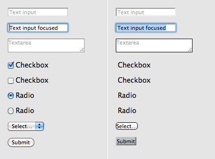
After making some additional styles for textareas, submit buttons, and focused fields, our form now looks something like this:
The appearance of our form is clear and the inputs are now consistent across a variety of WebKit browsers including Apple Safari, Google Chrome, and mobile browsers on iOS and Android devices. See the example in your browser.
With some simple modifications, we can completly change the look:
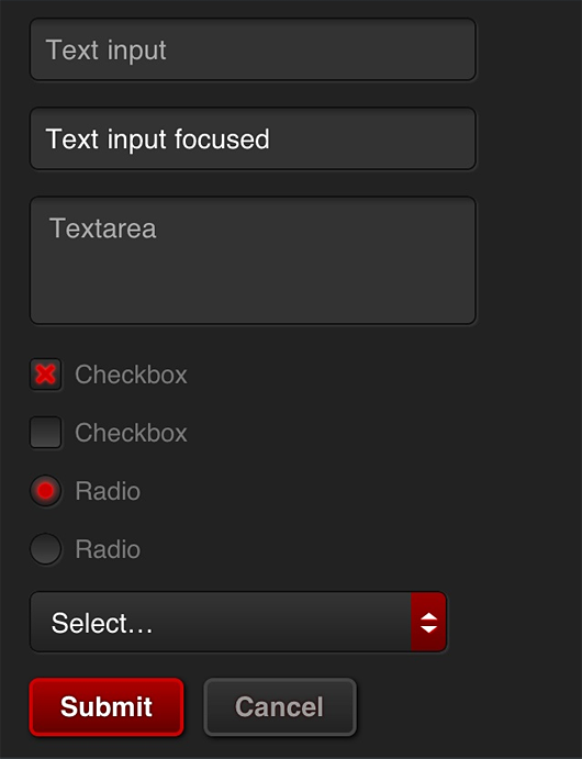
Working example of this alternate look.
Final thoughts
Certainly, changing the appearance of the default form widgets is not something to be taken lightly. Our approach here was a fairly conservative exploration in standardizing on an input style similar to Mobile Safari as a proof of concept. Radically changing UI that people have become accustomed to in their browser should be avoided unless there are substantial benefits to the user. We considered the case that someday 37signals would want to offer mobile versions of all of our apps. Having a standard set of inputs that feel like us, like the desktop apps that so many people are already used to is definitely a benefit. Regardless of your particular stance, it’s exciting that CSS3 finally gives us these powerful options for customization at all.
Tanner
on 13 Oct 10Beautiful and simple to put together. How about a quick addition on how to make the styles look similar across all browsers?
I’m curious how you would approach carrying the styles across multiple (read: non-webkit) browsers, background images? Less styling? Crossing your fingers?
Great walk-through, thanks Jason.
Dave Arel
on 13 Oct 10Radio buttons need a common name attribute. They don’t work correctly in the demo at the moment :)
Otherwise great article Jason!
JZ
on 13 Oct 10Tanner, in this case we were very focused on the capabilities of mobile WebKit. If we wanted to expand support to other browsers we’d have to look at each target browser and make compromises based on level of support—progressive enhancement.
Mike Rundle
on 13 Oct 10Wow, this looks really great. When I first saw the unstyled elements I never thought you could generate your own that would look far superior. Great job!
I’ve got one question: for your drop shadows you chose to go with the angle down & to the right, rather than the straight down shadow (90°) that Apple specifies in their HIG. Did you have some specific reasoning for the new angle? Or maybe just an oversight?
Matt Sanders
on 13 Oct 10I just read this and then the earth shook where I was sitting. Literally. (http://earthquake.usgs.gov/earthquakes/recenteqsus/Quakes/us2010ciay.php)
JZ
on 13 Oct 10@Mike – Thanks! Mark the 45º shadows as an oversight—an entrenched force of habit :) You’re absolutely right, those should be straight down.
George Adamson
on 13 Oct 10Lovely clear article, thank you. Could the selector for the checked style perhaps be reduced from input[type=checkbox]:checked to input:checked on the basis that only checkboxes and radios could be checked? (That is, assuming you wish to apply the same background image etc to both checkboxes and radios)
Ryan
on 13 Oct 10This is definitely a “because Webkit makes it easy” project. It wouldn’t be worth the hassle to do this across all the desktop browsers and, as JZ mentioned in his conclusion, the matter of replacing native elements at all is open for debate.
Sarah
on 13 Oct 10@37signals
I agree with Tanner, what’s the point in using this if the ONLY major mobile device using webkit is iPhone.
For what it’s worth, this looks terrible in IE 7
Lee
on 13 Oct 10@Sarah WebOS, Android, and soon Blackberry all use WebKit based browsers. Kindle too ;)
Sarah
on 13 Oct 10@JasonZ
Did you create this in an attempt to not have to use JQuery Mobile (which is exactly built to address this need)?
George Adamson
on 13 Oct 10@Ryan The jQuery Mobile project guys are in the early stages of experimenting with unifying the design across a number of platforms. See http://jquerymobile.com/designs
Eric
on 13 Oct 10@Sarah
Webkit is a defacto standard on mobile. Not only Apple, but also BlackBerry, Android, and WebOS (Palm) also are using webkit. I don’t think that WinMo7 is going to do well enough to justify not designing for webkit on mobile.
JZ
on 13 Oct 10@Sarah – Not at all. JQuery Mobile looks like a fine framework. This was an exploration—so learning was a priority— and we’d have learned less if we used a framework. Frameworks in general have pluses and minuses. When you use one to get some things you don’t need along with the things that you do. It’s not something we’d rule out in the future, it just wasn’t part of the discovery in this project.
I can't stop myself from saying this, I'm sorry
on 13 Oct 10you have a typo – the caption under your last image – “An alterate look based on the same code”
Nathan
on 13 Oct 10I also can’t fill basic form fields either
chrisbz
on 13 Oct 10Jason Z. is killing it with these mobile webkit post. Please keep them coming.
Matt
on 13 Oct 10Just wanted to thank Jason Z… this is a super helpful post. Well-written, crystal clear, and full of valuable insight and info that isn’t easy to find otherwise. A real valuable contribution to your readership.
Pedro Estarque
on 14 Oct 10Great stuff, but IMO, until you can style the select menu itself it’s not ready for use.
When you click the select menu in your second dark example, the discrepancy between the default drop down menu and the styled select box makes the whole thing look like a hack.
Unstyled forms maybe ugly, but at least they are consistent.
Elaine
on 14 Oct 10Looking good! Been meaning to update the design of my website’s contact form.. these make it look very easy :)
Giuseppe
on 14 Oct 10Try out SproutCore, format controls across all browser…
Peter
on 14 Oct 10Really nice work guys. Like the use of data urls for all the graphics too.
David Kaneda
on 14 Oct 10Another great post in the series, keep ‘em coming. We use a bunch of these techniques in Sencha Touch, but it’s always good to see how others come at it :)
Kevin Griffin
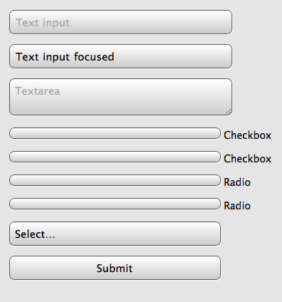
on 14 Oct 10For those interested here is what it looks like rendered in the nexus one browser.
Kevin Griffin
on 14 Oct 10For those interested here is what it looks like rendered in the nexus one browser.
JZ
on 14 Oct 10@Kevin – I noticed that, too and I suspect it has to do with the dataURI images I’m using for this example (easier to distribute as a download). Those same checkboxes work fine in the app we’re developing using linked image files.
I haven’t had a chance to investigate further.
Giacomo Colddesign
on 15 Oct 10Really helpful, thanks..!!
Tadas Tamosauskas
on 15 Oct 10The form looks really nice and fancy, however I don’t really like the idea of putting a cross on selected checkboxes instead of a tick. That is confusing, because cross usually means that smth is crossed out, not selected… or is it just me? :)
Sparsh
on 19 Oct 10looks good. i will try to put this type of contact form in my website. i like this concept.
frank
on 19 Oct 10Great Work. Thanks a lot.
simboyz
on 20 Oct 10very useful article! thanks~
click here
on 20 Oct 10I must say that’s a good one. Provides an elegant and a clean look, and thus will be praised by many to have some good works. I think that it would be a very good thing to have implemented it at a couple of places as it is only then that it will gain some good responses.
This discussion is closed.