In fact, when I was finishing the site RoR site went up! it has a “sense” of a little bit of everything in the Web 2.0 world, but hey, it looks great!
Before I had a way too complex logo, this new logo works great! one advice to all: make an easy to look at logo. I only need one color for my logo and when I have to print it on anything, it cost nothing and it always looks great.
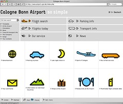
Maybe it’s a cultural difference, but the globe (advertisment?) and mountain icons fail for me. Could anyone figure out what they mean without the text?
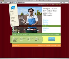
Anyone used Blurb yet? I’m dying to give it a go, but finding the time is proving tricky. Would love to hear any successes…
ron
15 May 06
i don’t really see 37 as design experts..but whatever.
German
15 May 06
I soooo thought the same thing about the similarities between 37s and Emaginacion from seeing Javier’s link on previous comments. Glad I’m not the only one. Maybe I’m not crazxy after all. Maybe.
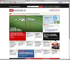
Though a good development effort, I’ve never liked UX Mag - the home page must be one of the hardest to read/follow ever.
blort
16 May 06
i like the fresh look of the airport site. it is a very table-driven layout, though, for better or worse. i know some people have strong opinions about table layouts.
The design elements of CGN remind me of the Newton OS.
I remember me designing a Newton theme for the then Mac OS System 7.x with Kaleidoscope. Still great.
Hey come on Rebort! I thought the name like for, 20 minutes!
Nah, really; the name was “imaginacion”, which is, imagination on english. I first launched the agency on Argentina, where is based, so the name was pretty much something cool around here; I changed the “I” for an “E” and it made sense once. But yes, some people told me the name has to go, I’m personally attached to it.
But enough of it, did someone found inspiration around the sites Matt posted?
“And I have to agree with Clark on UxMag. At first glance, the layout grabs � then it�s all confusion. What do you look at first?”
Are the 2.0 users morons? That’s why because the trends are a big announce, giants buttons and text for 4 years old kids?
Man, I give you a newspaper and you’re gone mad!
Stop this nosense ugly design tendencies, please.
john
16 May 06
The look of the airport site is fantastic. I love it. I love the little music pop-up, too. It postiviely invites exploration.
However, the coding leaves a little to be desired. Some of it really NEEDS ajax, instead of refreshing the whole page, which causes a break in the experience, to me.
Jim
17 May 06
UXmag sucks mate!
Jim
17 May 06
UXmag sucks bloody greek copycats
Olliver
21 May 06
In response to Natalie regarding Blurb, I am in the process of making a book documenting, from start to finish, a spec house I have just finished building. I want this book to be a marketing tool, a record for me, and a gift for the ultimate buyer. I have taken pictures almost daily since I bought the lot so I have lots of material. I am about half way through making my book, and have spent about 2 hours so far. That time was spent learning the program and importing my content. I would recommend organizing your picture before importing them. The program is pretty straight forward and very clever for layout. I should be finished in an hour or less, and I think my book will be very cool. I’m very impressed especially given that it’s a beta. Give it a try.
27 comments so far (Jump to latest)
Javier Cabrera (ClearYourMind) 15 May 06
Hey! its nice to see my site over here!
Muchas Gracias Matt!
Javier Cabrera
Rob Cameron 15 May 06
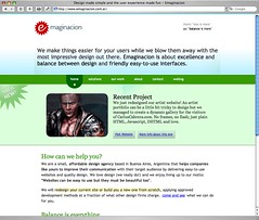
Is it just me or does the eMaginacion site have a very distinct 37signals “feel”?
Or is that just the generic Web 2.0 “feel?” ;)
Conspi 15 May 06
I had the same 37’s look and feel when I first saw it. Surely comes from the blue to white header gradient.
Mark 15 May 06
I thought the same thing the first time I saw emaginacion.
The fade, the colors, the positioning…and the value prop is what 37s used to do.
…..
I’ve liked the UXMag design since it launched, but the content hasn’t changed…since it launched.
Javier Cabrera (CYM) 15 May 06
Howdy!
In fact, when I was finishing the site RoR site went up! it has a “sense” of a little bit of everything in the Web 2.0 world, but hey, it looks great!
Before I had a way too complex logo, this new logo works great! one advice to all: make an easy to look at logo. I only need one color for my logo and when I have to print it on anything, it cost nothing and it always looks great.
Dan Diemer 15 May 06
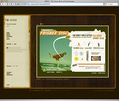
Good call on Scott Hanson (iso50)’s stuff.
Steven Lumos 15 May 06
Maybe it’s a cultural difference, but the globe (advertisment?) and mountain icons fail for me. Could anyone figure out what they mean without the text?
ceejayoz 15 May 06
emaginacion has a little dig at 37s, too…
“them: ‘less is more’
us: ‘balance is more’”
Natalie Ferguson 15 May 06
Anyone used Blurb yet? I’m dying to give it a go, but finding the time is proving tricky. Would love to hear any successes…
ron 15 May 06
i don’t really see 37 as design experts..but whatever.
German 15 May 06
I soooo thought the same thing about the similarities between 37s and Emaginacion from seeing Javier’s link on previous comments. Glad I’m not the only one. Maybe I’m not crazxy after all. Maybe.
Bob Aman 15 May 06
Interesting… ISO50 — Quite possibly the first site I’ve ever been to that featured background music that didn’t actually totally piss me off.
Clark 15 May 06
Though a good development effort, I’ve never liked UX Mag - the home page must be one of the hardest to read/follow ever.
blort 16 May 06
i like the fresh look of the airport site. it is a very table-driven layout, though, for better or worse. i know some people have strong opinions about table layouts.
Hans 16 May 06
The design elements of CGN remind me of the Newton OS.
I remember me designing a Newton theme for the then Mac OS System 7.x with Kaleidoscope. Still great.
Alex Schleifer (UX Magazine) 16 May 06
Thanks for having UX Mag up there. We’re working on getting it out of beta very soon, finally.
Rebort 16 May 06
I like the look of the Emaginacion site a great deal (although, yes, it is 37Signals-ish). But that name. Ugh. Worst name since … eNormicon. ;)
And I have to agree with Clark on UxMag. At first glance, the layout grabs … then it’s all confusion. What do you look at first?
Javier Cabrera (CYM) 16 May 06
Hey come on Rebort! I thought the name like for, 20 minutes!
Nah, really; the name was “imaginacion”, which is, imagination on english. I first launched the agency on Argentina, where is based, so the name was pretty much something cool around here; I changed the “I” for an “E” and it made sense once. But yes, some people told me the name has to go, I’m personally attached to it.
But enough of it, did someone found inspiration around the sites Matt posted?
Danny de Wit 16 May 06
Although there are similarities in the (earlier) 37 signals site and the emaginacion site, I don’t think that makes it less inspiring.
I mean there are some things in modern webdesign that once available, will be used more often. Like the gradient sky.
It’s just good design, because it serves it’s purpose.
Javier’s site is fresh, clear and sparkling. I use it as a reference of ‘Good Design’ often.
You can’t blame someone for using a wheel, once it’s been invented.
Just my two cents.
2.0 design sucks 16 May 06
“And I have to agree with Clark on UxMag. At first glance, the layout grabs � then it�s all confusion. What do you look at first?”
Are the 2.0 users morons? That’s why because the trends are a big announce, giants buttons and text for 4 years old kids?
Man, I give you a newspaper and you’re gone mad!
Stop this nosense ugly design tendencies, please.
john 16 May 06
The look of the airport site is fantastic. I love it. I love the little music pop-up, too. It postiviely invites exploration.
However, the coding leaves a little to be desired. Some of it really NEEDS ajax, instead of refreshing the whole page, which causes a break in the experience, to me.
Jim 17 May 06
UXmag sucks mate!
Jim 17 May 06
UXmag sucks bloody greek copycats
Olliver 21 May 06
In response to Natalie regarding Blurb, I am in the process of making a book documenting, from start to finish, a spec house I have just finished building. I want this book to be a marketing tool, a record for me, and a gift for the ultimate buyer. I have taken pictures almost daily since I bought the lot so I have lots of material. I am about half way through making my book, and have spent about 2 hours so far. That time was spent learning the program and importing my content. I would recommend organizing your picture before importing them. The program is pretty straight forward and very clever for layout. I should be finished in an hour or less, and I think my book will be very cool. I’m very impressed especially given that it’s a beta. Give it a try.
Nano 08 Jun 06
My math:
Given emaginacion, if inspiration tends to copying, then imagination tends to zero ;-)
By the way, wouldn’t be easier to use a WordPress template? LOL, j/k
Cheers fellow argentinean!